
Since we opened the restaurant in Beaminster ten years ago we haven't changed the interiors that much, we started out when I was rather into grey, using Hardwick White from Farrow & Ball for all the walls, except one feature wall in Yellow-Pink from Little Greene. I have come out the other side of the grey phase but still love yellow as it is a great colour for kitchens and dining rooms. I ghost wrote a book a many moons ago for paint colourist, David Oliver - The Paint & Paper Library - A Masterclass in Colour & Light, hence I did a fair amount of research in colour psychology & chromotherapy.
As yellow is associated with the sun, it is regarded as a positive and uplifting colour. In addition to its mood-boosting effects, yellow is also known for its ability to stimulate the nervous system and increase energy levels - in turn aiding digestion and metabolism.
So a few years ago, before the pandemic the grey and yellow walls were consigned to the archive and in came Setting Plaster from Farrow & Ball. This colour remained until we re-opened after all the lockdowns and re-painted the main walls Pink Ground from Farrow & Ball. Setting Plaster has much more yellow in it and is definitely a very warm pink. Pink Ground, however, is much lighter with more white and perfect to create a lighter ambiance when the sun is shining.
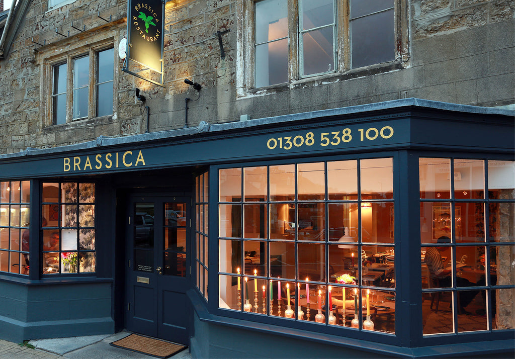
The exterior of both Brassica Restaurant & Brassica Mercantile has always been Railings by Farrow & Ball. A fantastic deep blue/black which has stood the test of time. Perfect base for the gold leaf signage by AJSigns. Andy Misslebrook is an incredibly talented signwriter working in the South West and a master in gold leaf, colour and pattern.

All of the colour inspirations for Brassica Restaurant actually began with a sofa from my great friends collection - Pinch Design. Their Pendel sofa was upholstered in a fabric by Jobs Handtryck, a family-run hand-printing house which was founded 1944. Their colourful designs mirror the fauna and flora of the landscape in Dalarna, Sweden where the company is situated. We went on to use their 'Rabarber' fabric in natural linen in the restaurant and then as a wallpaper in Brassica Mercantile.


Last July we opened Brassica Forno in Bripdort. An Italian-inspired bakery and production kitchen. We took over a closed bakery, Leakers - a listed building on the high street, a small space with a lovely if not wonky frontage.

When the front was in the process of being painted, I received a phone call from a woman who lived in a village close to Bridport, announcing she had reported me to the Listed Buildings Officer. She believed the colour was disgusting and a complete eyesore and had been conducting a survey outside the building when I wasn't there. Since opening, we have had numerous emails asking the colours used. The exterior is Olive Green by Little Greene. The interior colours are as follows - the shelving is also Olive Green, the window interior, Basalt, and the ceiling decorative panel, Blush, all by Little Greene. The counter is Mad King George, a discontinued paint colour by Fired Earth which I had mixed up in Dulux.
Leave a comment